Frida
Boogers, butts, and beyond.
Challenge
Frida had a problem every company wants. They were gaining brand recognition and customers in droves, but didn’t have a site that could handle it. Obviously they needed a redesign, but not only that, they needed a whole new digital approach. One that could allow internal teams to manage content, parents to be educated and give the brand a boost in the viral marketing department. In essence - a rebuild from the ground up.
Our Solution
We created a highly customizable global module system so the team could easily manage products and content long after the new site was launched. We then restructured their global navigation to create clear paths for users who wanted to shop and users who were looking for product/parenting information. This two-pronged structure (shopping and education) was compounded on by simplifying their purchasing UX and developing a How-To section/blog. Both creating more opportunities for increased sales and social influence respectively. Not so humble brag, BUT immediately after launch, the site was nominated for a CSS Site of the Day award. :)
Knowledge labs
User Experience, Product Design, Strategy
Industry
E-Commerce, Technology, Health
UX & Design
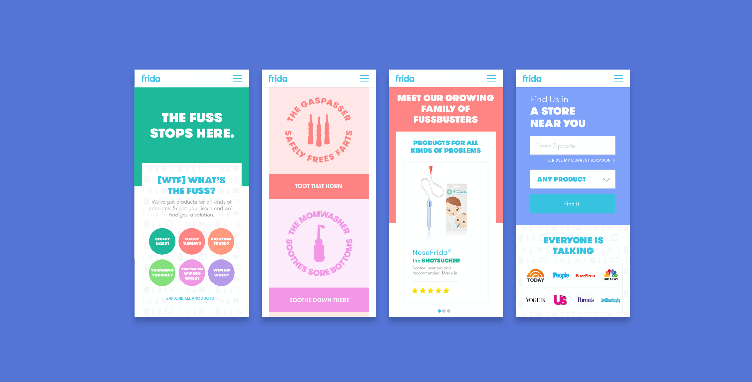
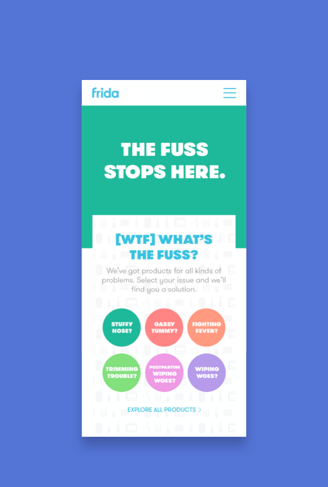
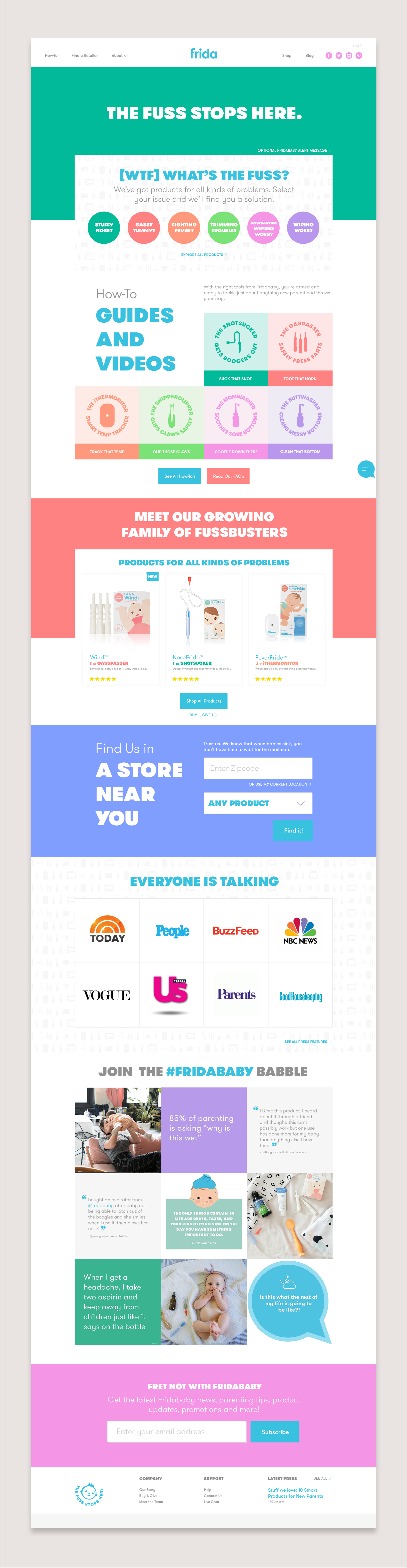
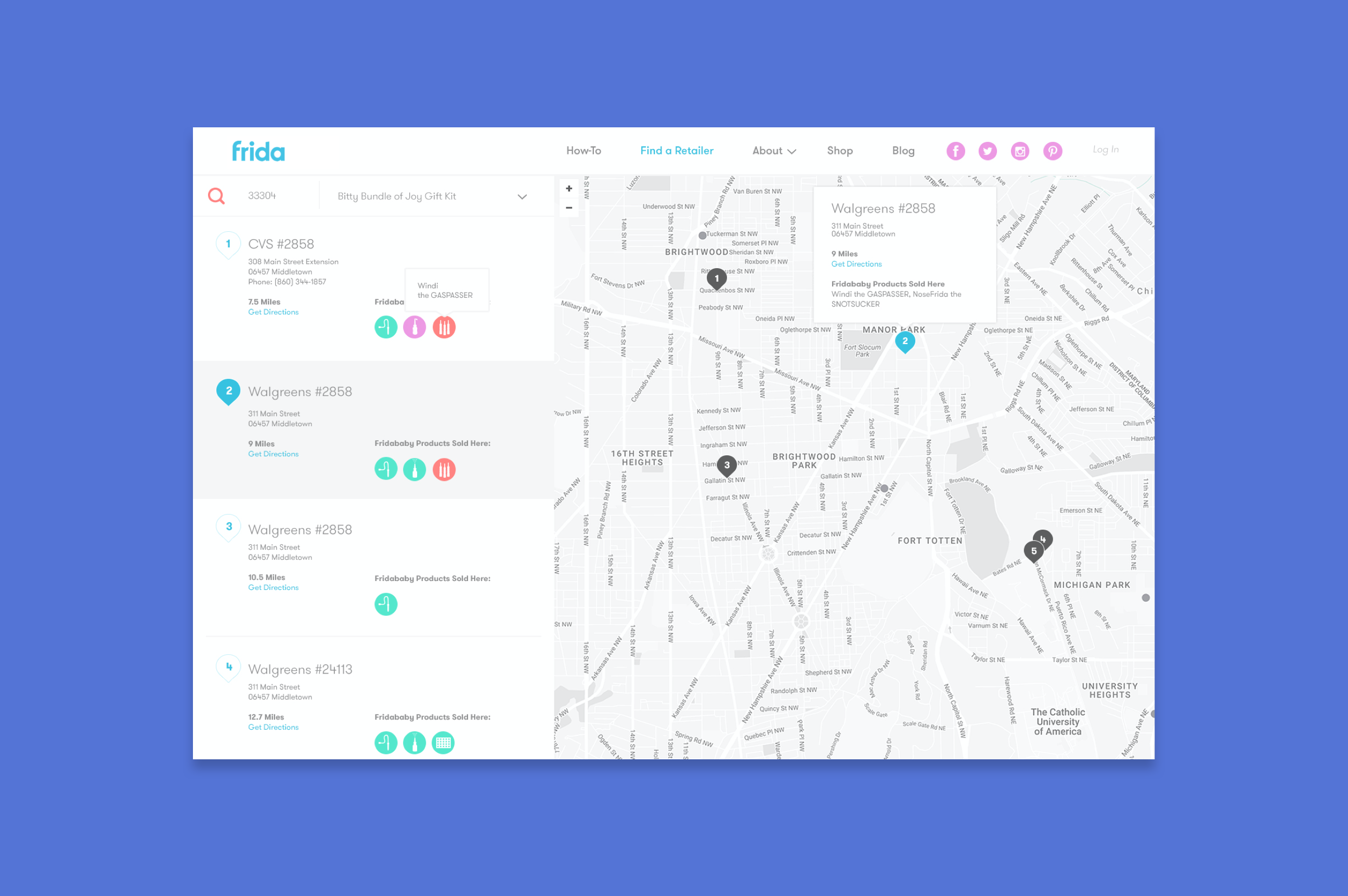
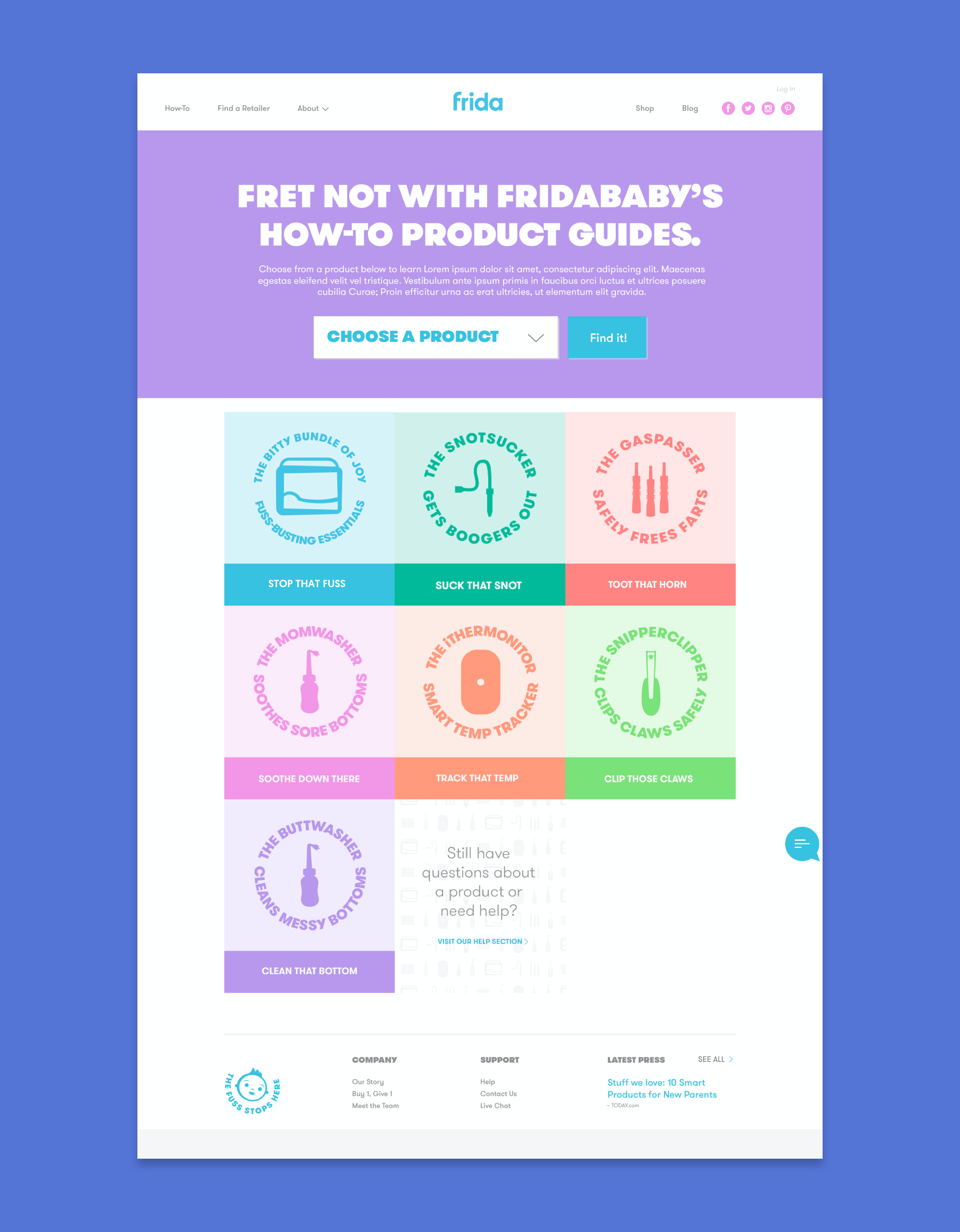
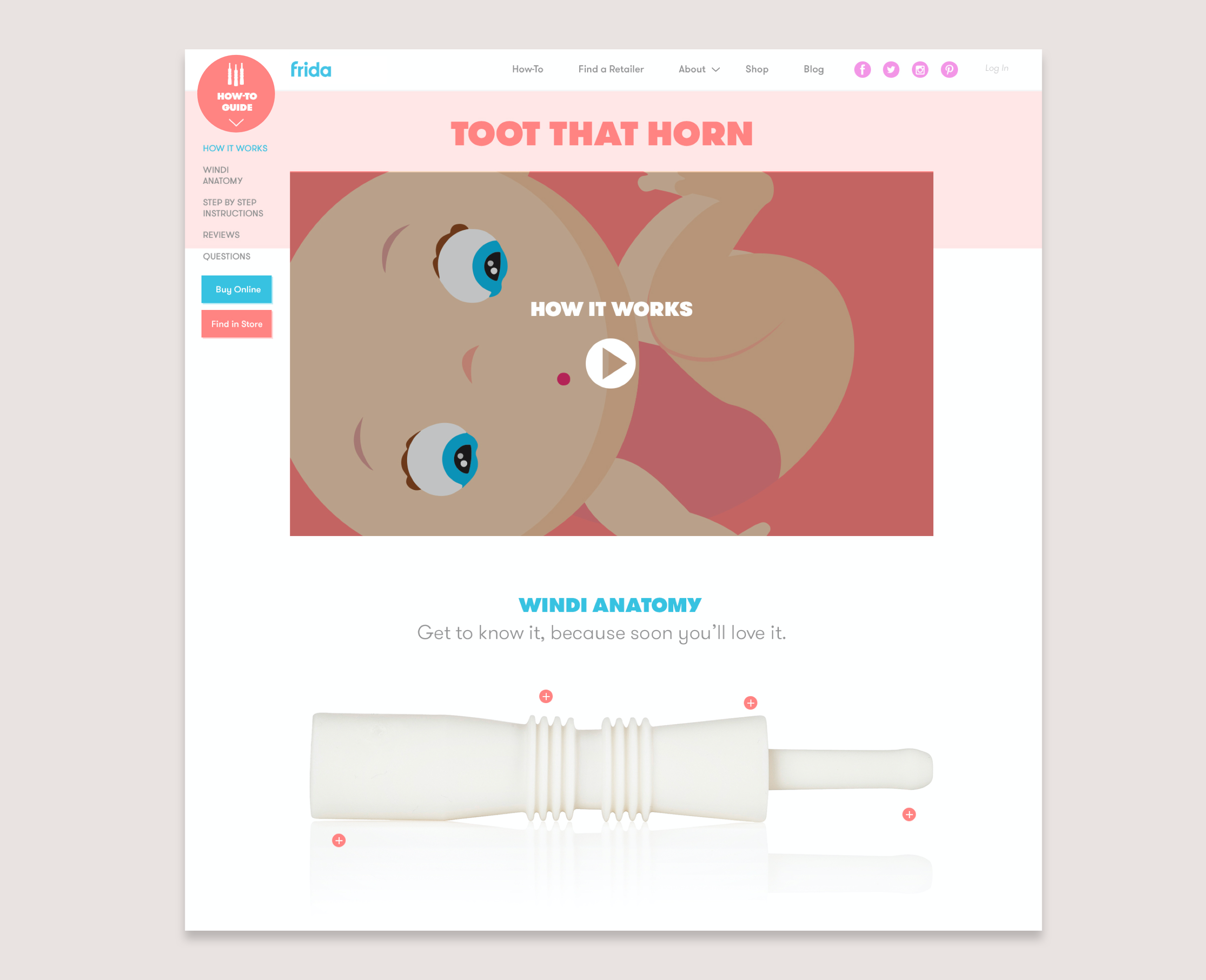
Frida decided to make the shift from being a purely e-Commerce site into an educational platform, so our focus was centered around redesigning the global navigation for two seperate users - those looking to buy products, and those who have a product but need help using it.
The homepage design was created to showcase their bold and quirky brand voice, while guiding users down the right path-to-purchase. Custom illustrations and bright brand colors differentiated Frida from the market and tied closely with a successful social campaign.
We were pleased and excited with our new website that Gallardo Labs created for us. The team was very attentive and responsive throughout the process, making us feel comfortable with managing our new website. Since the launch, they have always been available to help us with any maintenance or update requests that are needed.
- Chelsea Hirschhorn, CEO
Content Strategy
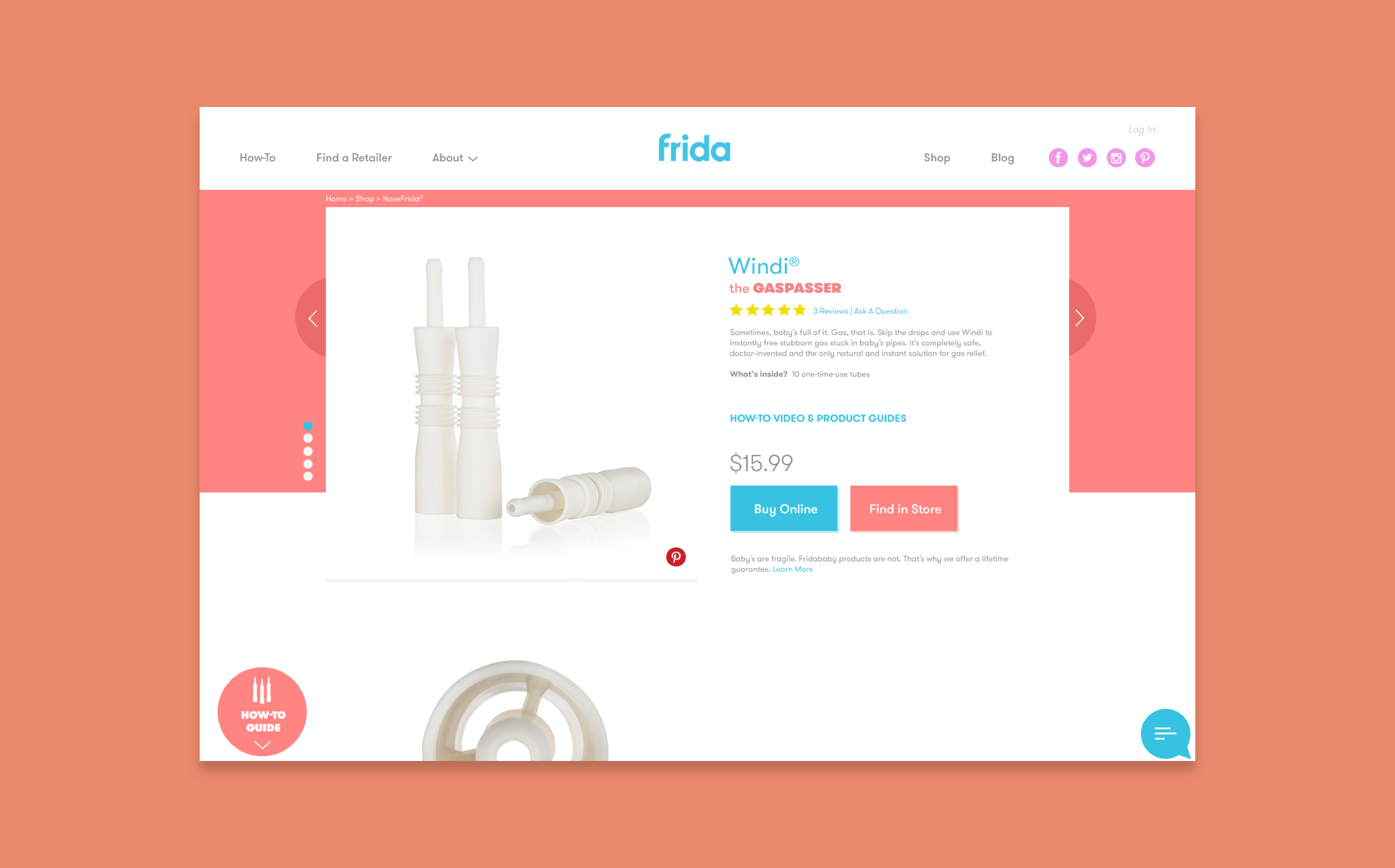
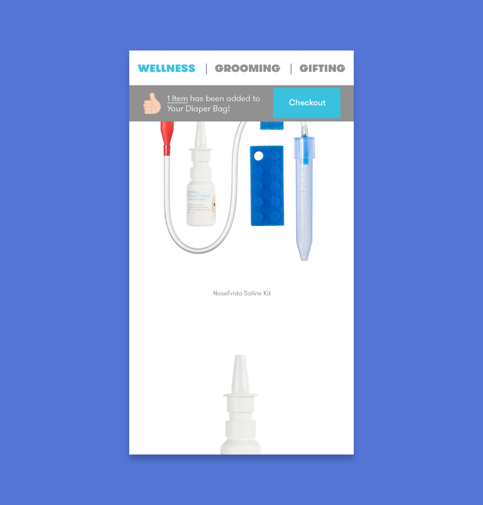
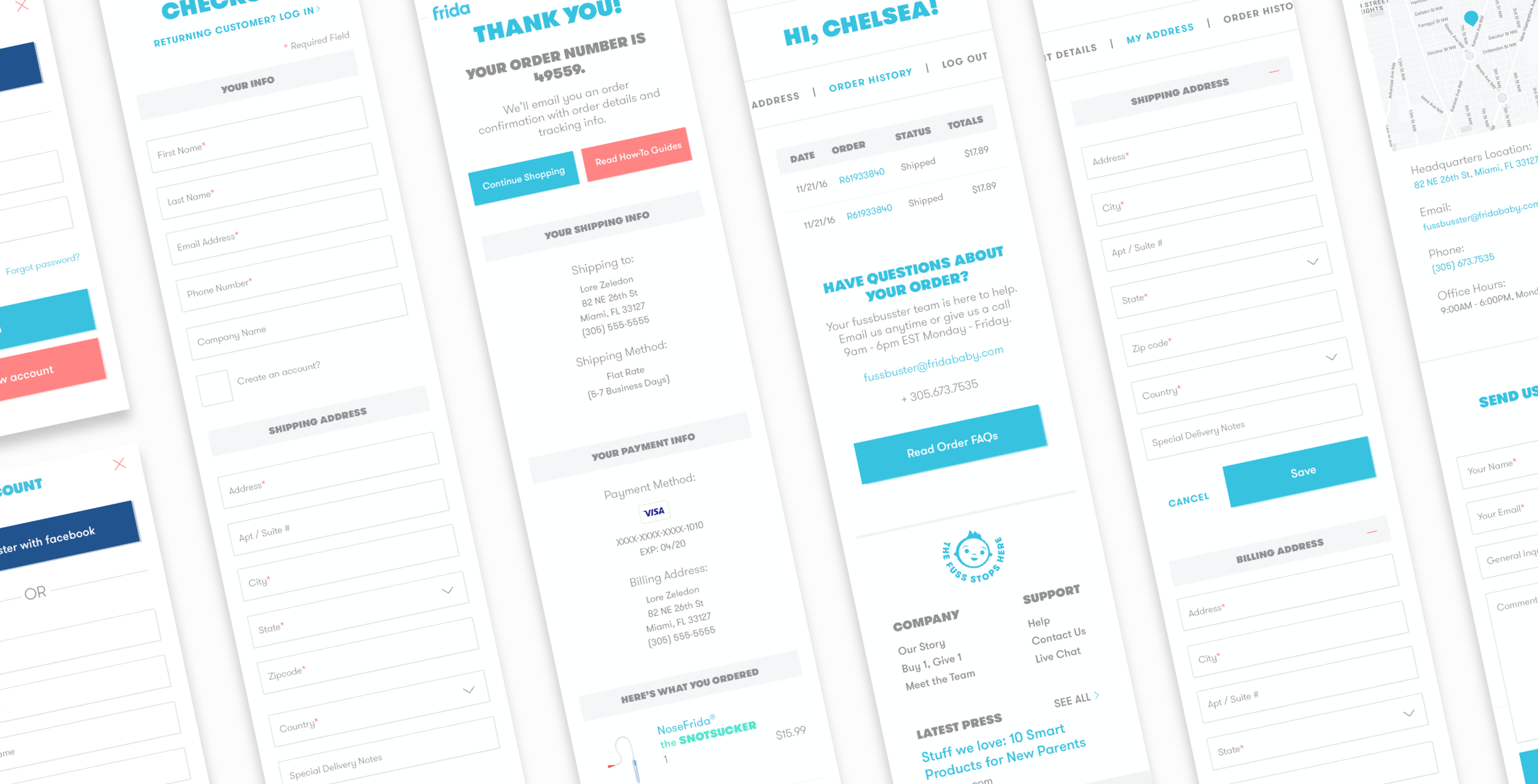
In addition to creating robust and dynamic educational center, we also streamlined the shopping flow. Product content was de-cluttered, reorganized, and then important elements were revealed contextually at the precise moment the user needs them…without them them having to look.
The Numbers
7x
company growth since launch
38
products added since launch
We are grateful for our who-do-I-call-in-the-middle-of-the-night-because-my-baby-won't=stop-screaming brand partner.


