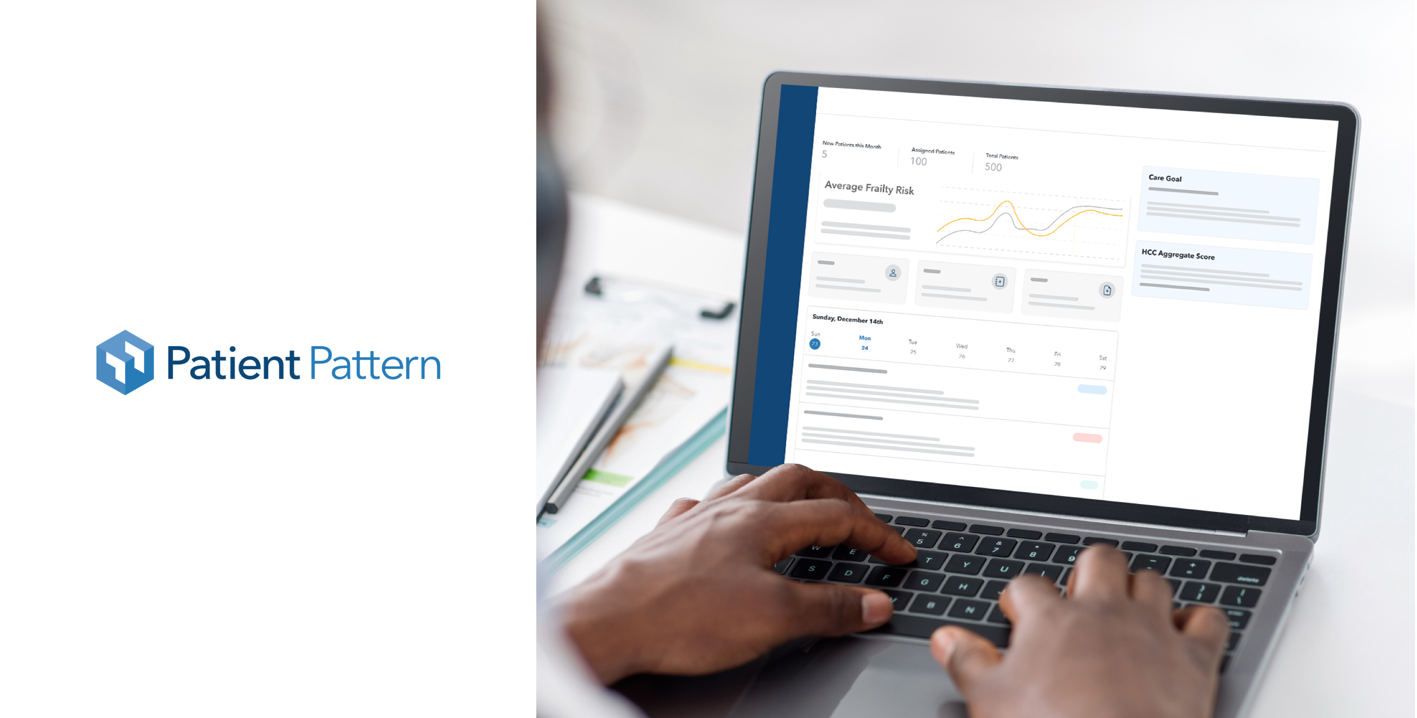
Patient Pattern
Setting a new global standard in healthcare software.
Challenge
Patient Pattern's cloud software Care Coach began as a platform to help payers and providers use the emerging practice of Frailty to help deliver greater care for geriatric patients. Through working closely with their customers, Patient Pattern discovered that the tool could expand to solve some of the biggest industry challenges that no single software in the market has addressed.
Our Solution
A redesigned software solution that is aligned with their ultimate vision of greatly improving patient care. We followed our UX process to identify and solve for their customer's biggest pain points while setting the company up for better financial outcomes. The redesign incorporated several new innovative features and was done efficiently while creating their first ever Design System in Figma. The new user experience and visual design focused on reducing the cognitive load of the often overworked care providers while strategically "coaching" them with suggestions based on best practices.
Knowledge labs
Strategy, User Experience, Product Design
Industry
Health, Technology
Discovery & Research
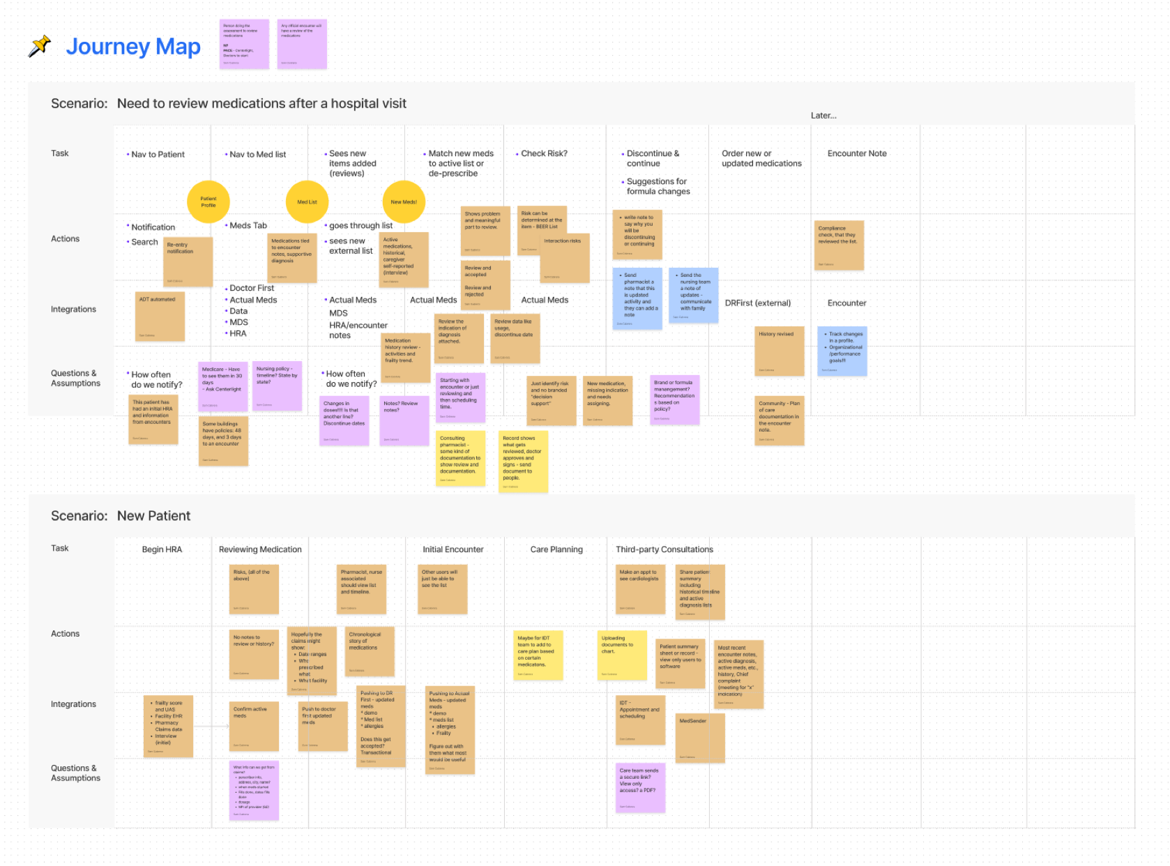
We conducted an extensive and robust discovery phase to dive deeper into the current product and identify overall challenges in the industry. With Patient Pattern's founders, stakeholders, and customers we identified key strategies to improve the product experience and encourage behavior that would prove better clinical outcomes.
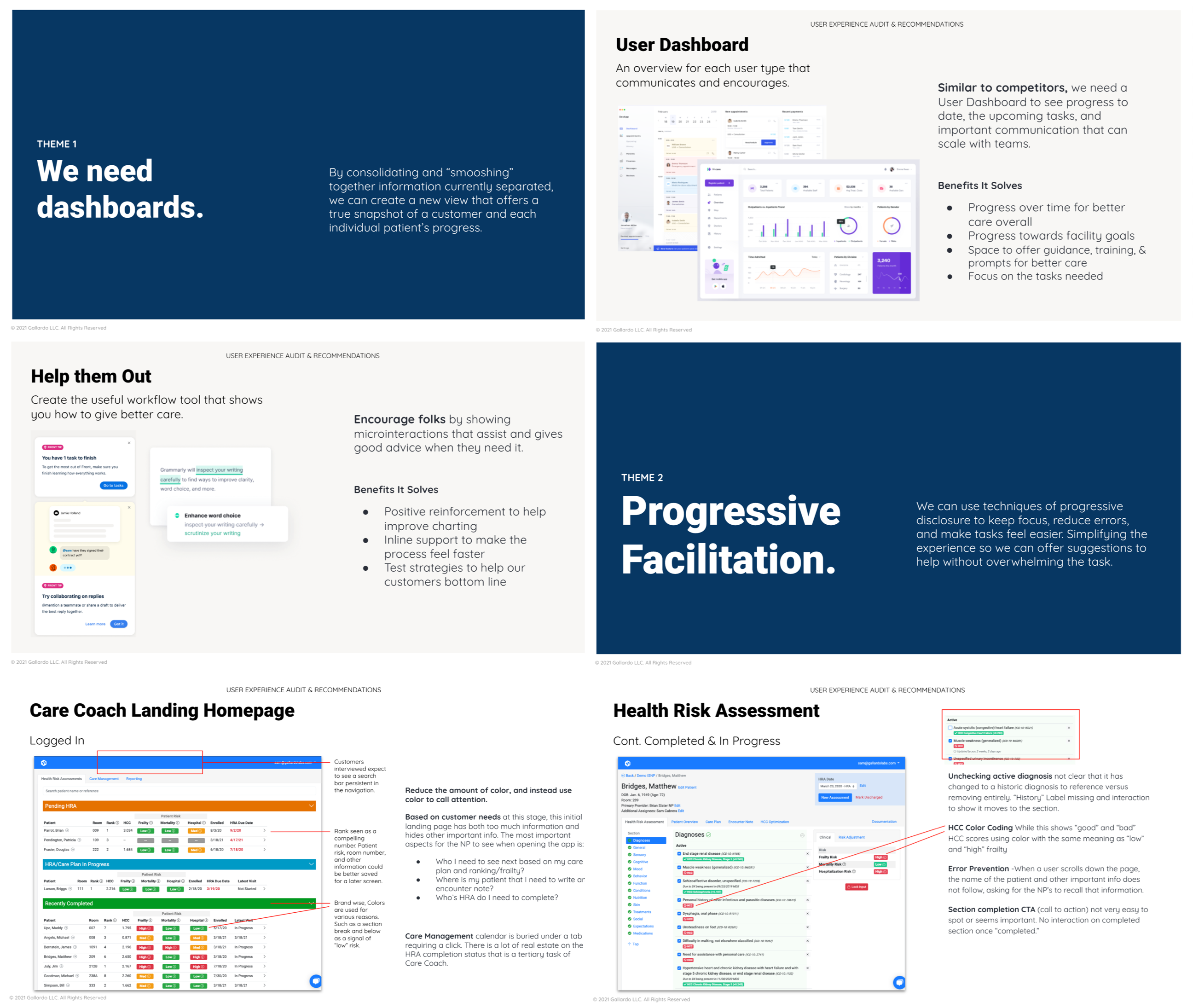
Followed by competitive research, user journeys, feature exploration, documentation, and deep analysis, we conducted a UX audit for the current Web App called “Care Coach.” It included best practices and recommendations that identified new opportunities to improve the platform.
We ran a UX Strategy Workshop with the client and team to define initial goals, requirements, ideas for features, assumptions, and possible solutions for the upcoming product, according to each usertype’s use case.
Design System
Week-by-week using an agile methodology + brainstorming/collaboration sessions with key stakeholders and real users, we created the new platform wireframes. These were guided by the recommendations we provided in the UX Audit as well as learnings gathered from several other methods of reasearch.
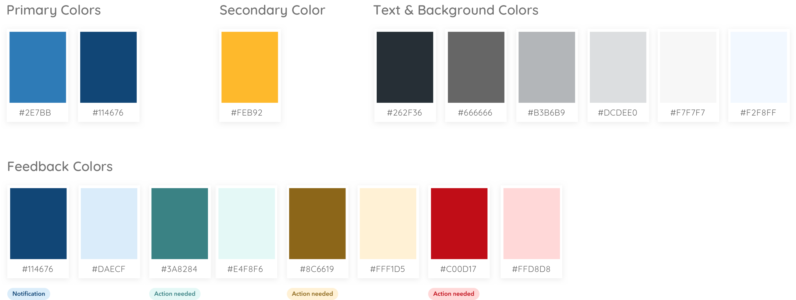
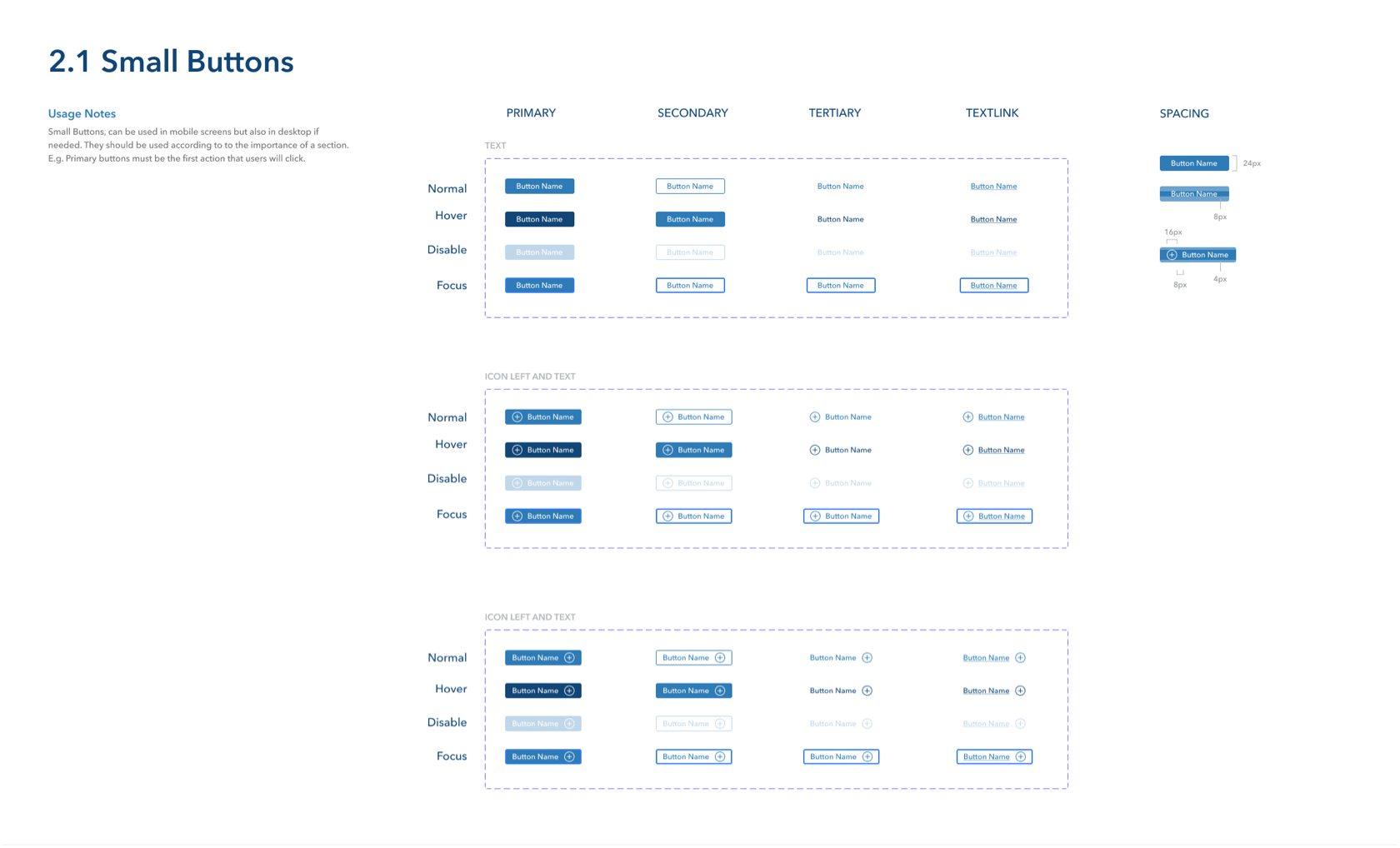
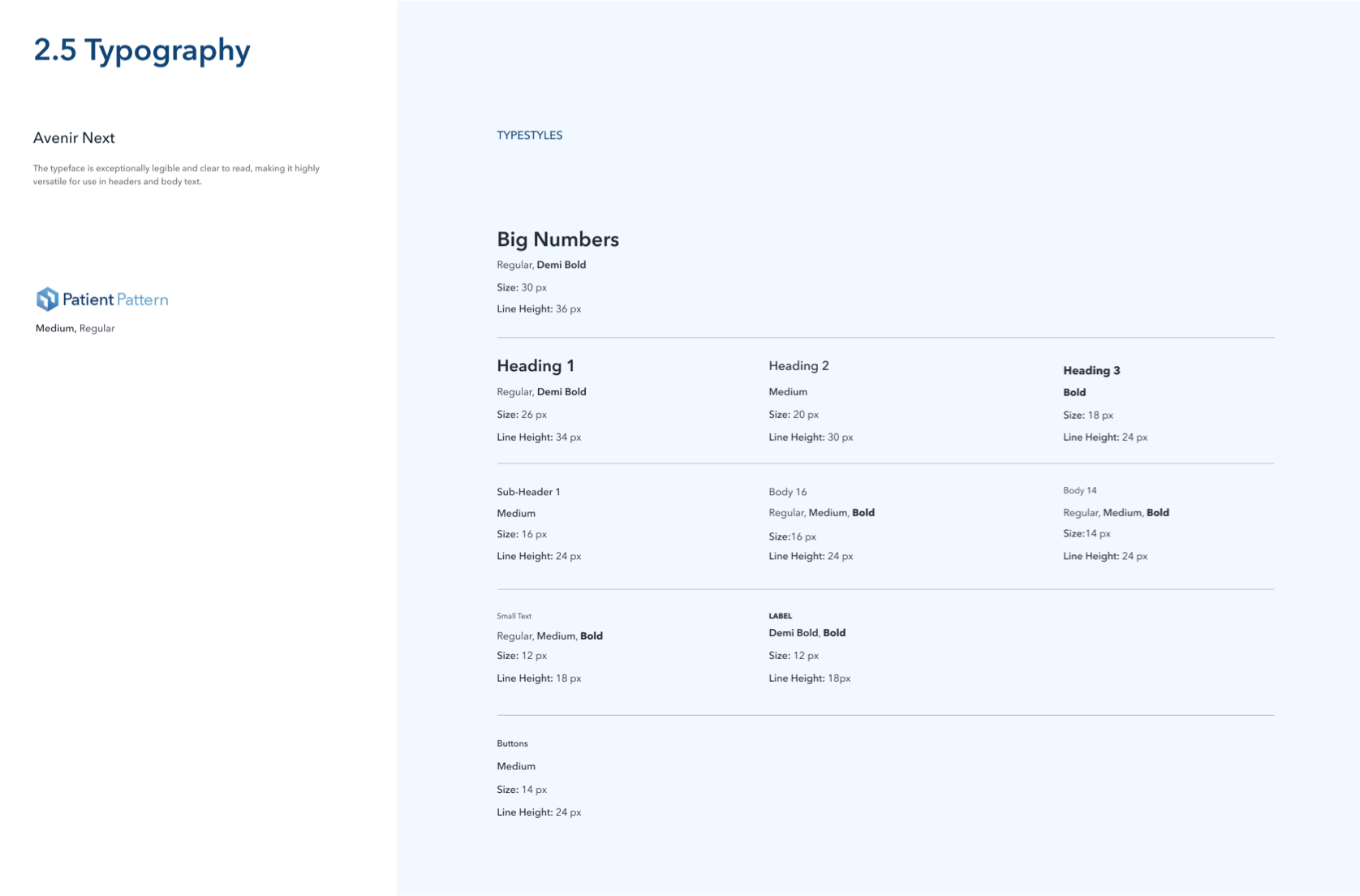
Once we had a base, we defined the platform's aesthetics and design system, which created a better and improved experience for its users. By setting design system rules, the platform became easier to execute while keeping consistent. We created a full Figma component library including new color palette, app components, iconography rules, typography styles, etc.
UX & UI Design
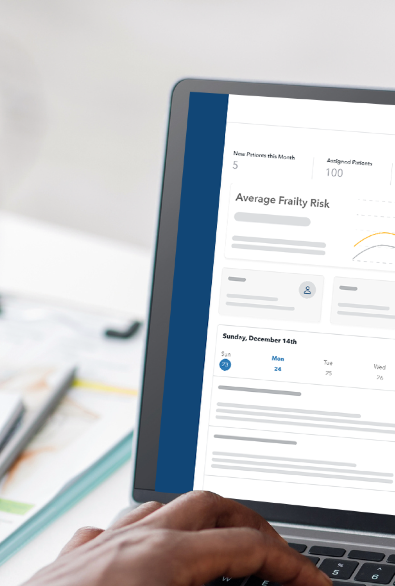
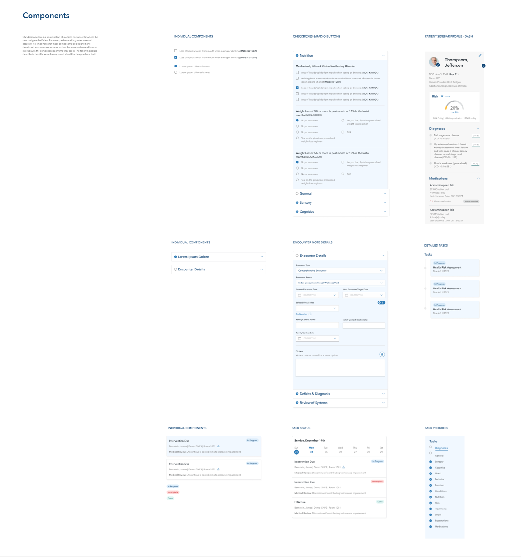
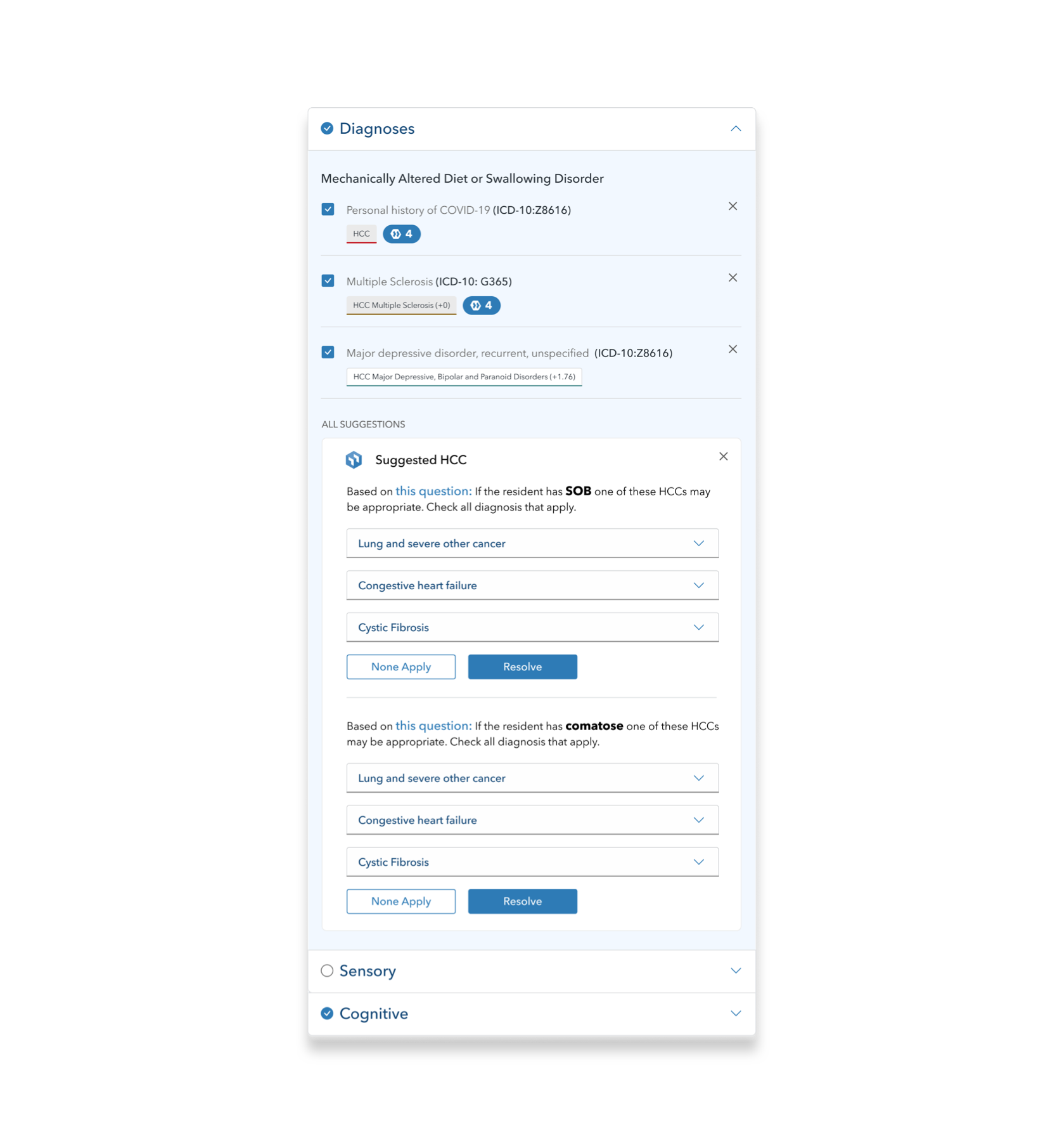
After analyzing the initial UX audit of the existing application, we defined the best way to consolidate all essential information into one screen. Dashboards were created for the users (nurses) that have their daily tasks and patients’ progress at hand. Team collaboration was one of the highlights of this project. We were able to iterate the designs with real users and healthcare stakeholders who provided valuable insights.
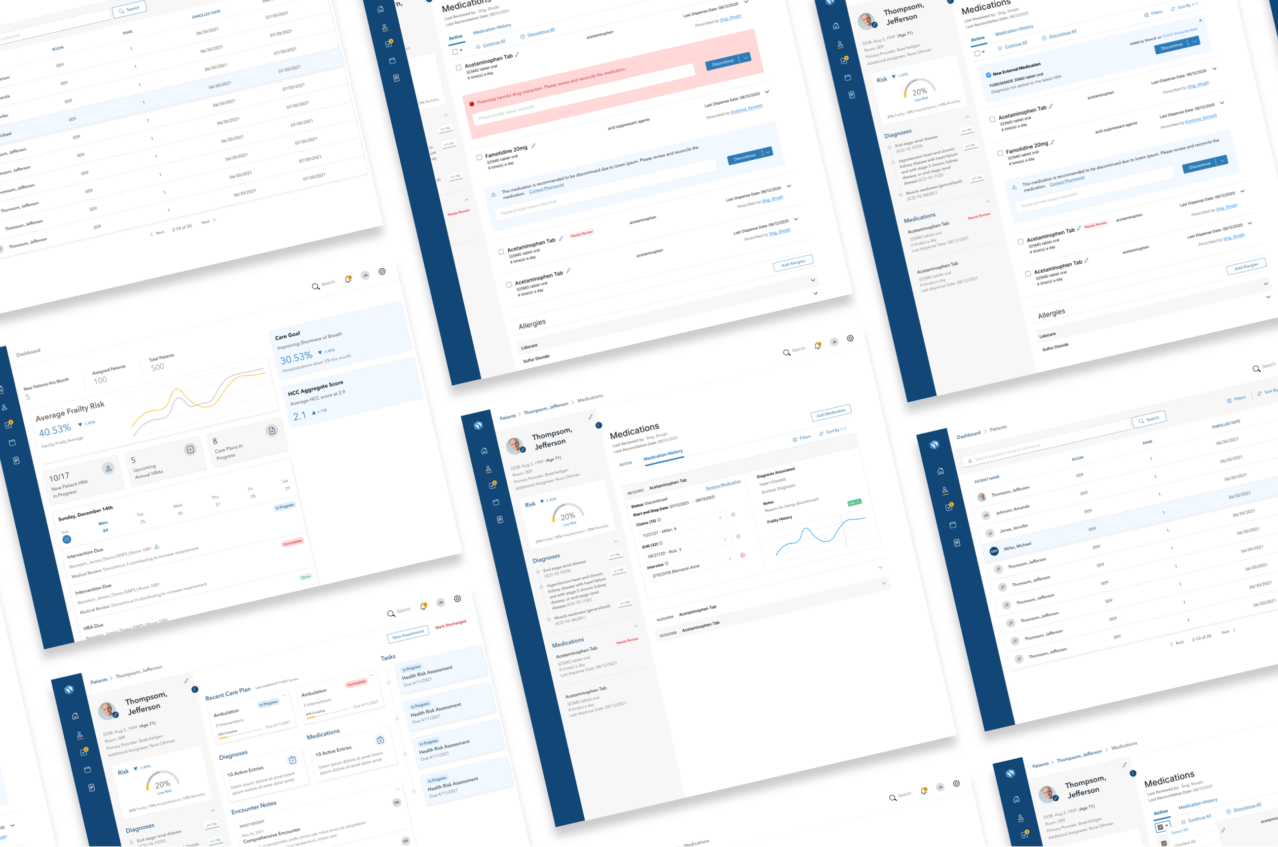
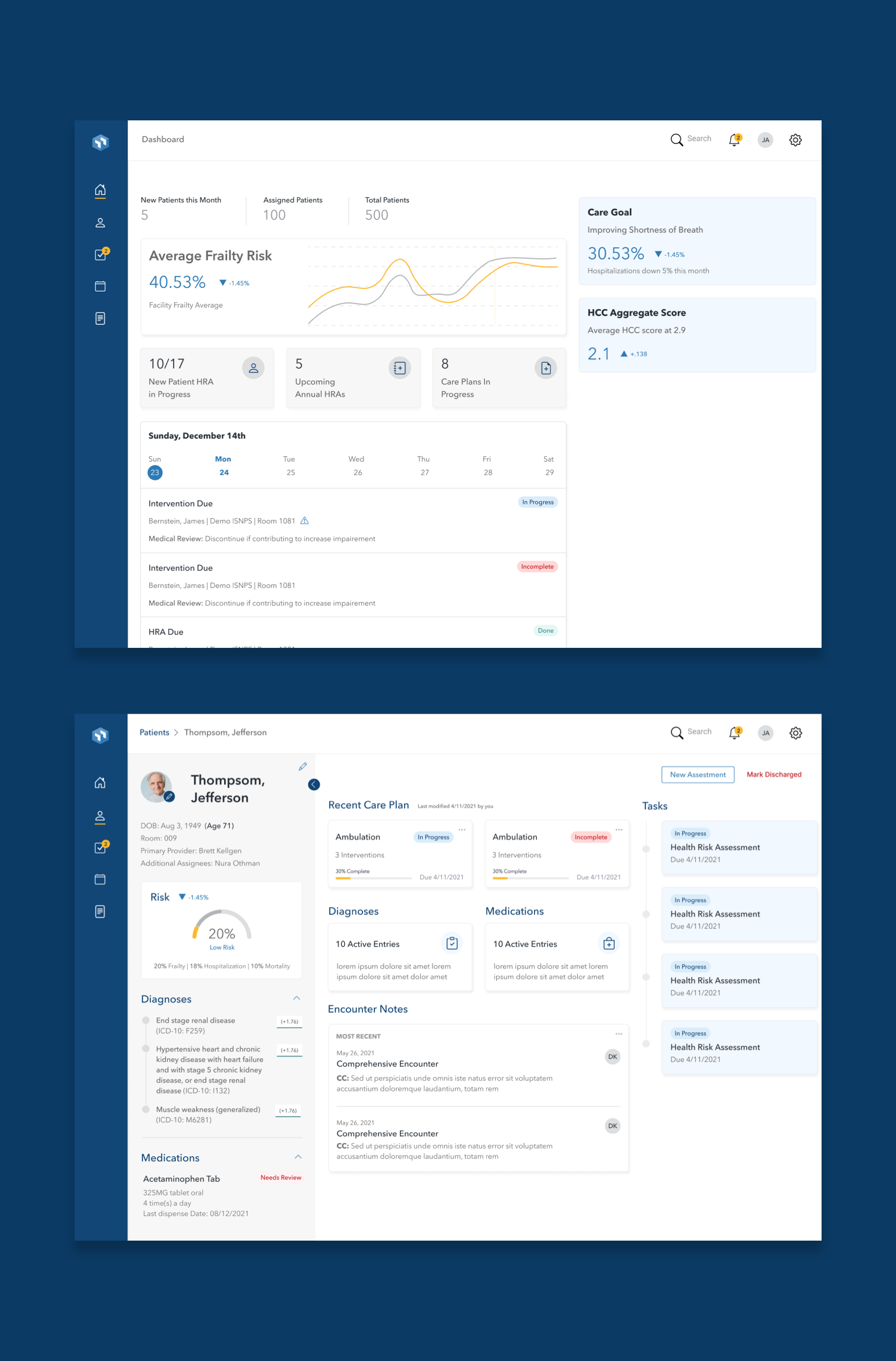
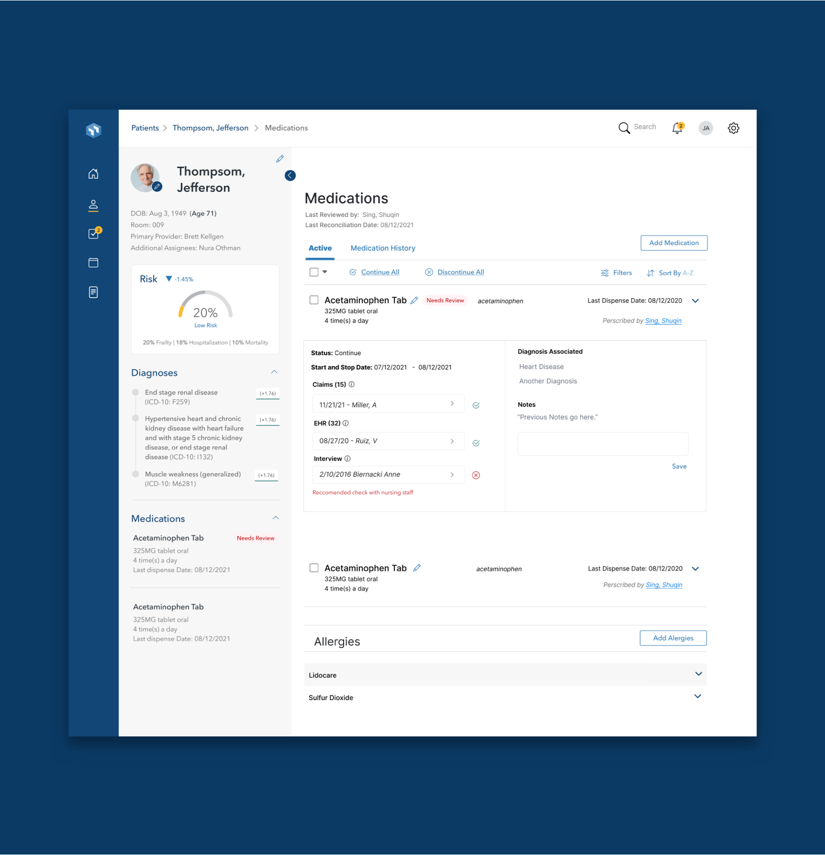
Users were encouraged by microinteractions that assist and provide guidance when needed.
Delivering precise and appropriate care with superior outcomes.


